


Most "look what AI built" demos stop at a landing page. This one has accounts, chat history that survives a refresh, and a language toggle — the boring infrastructure that usually turns a weekend demo into a three-week project.
Total build: one sentence, two taps, one screenshot, and about four rounds of feedback. Here's what happened at each step.
Build summary
| App | Pupffz — dog breed research chat |
| Starting prompt | "make me a agent which helps me do research on dog breeds" |
| Model | Claude Sonnet 4.6 |
| Generated | React frontend, Python agent, auth, chat storage, EN/ES |
| Hand-written code | None |
Step 01 — One sentence, then two decisions
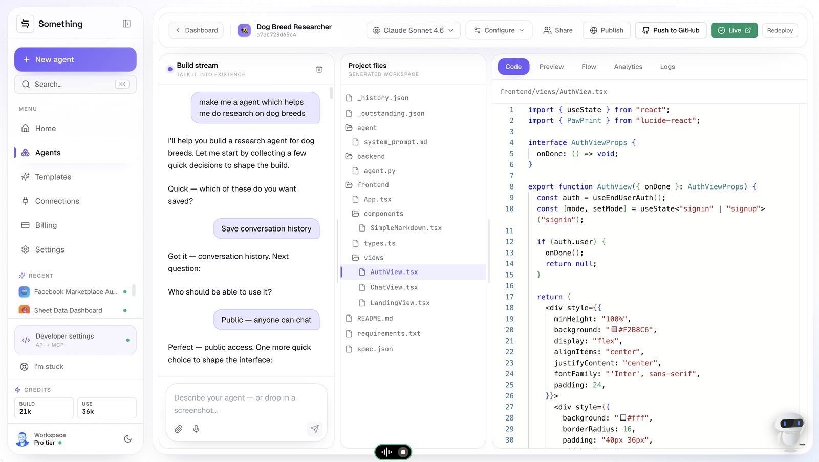
The prompt was nine words. Instead of a settings screen, the builder asked two questions with tappable answers — which of these do you want saved? (Save conversation history) and who should be able to use it? (Public — anyone can chat).
Those two taps are doing more work than they look. "Save conversation history" means a data layer. "Public — anyone can chat" means end-user accounts, separate from my builder account. Both got provisioned from a button press.
Step 02 — Then I stopped describing and just showed it
This is the part worth paying attention to. Rather than writing a paragraph about the aesthetic I wanted, I dropped an image into the chat and said: "i need the landing page to be like this. exactly same. font, colors all same pls".
It read the design out of the image before writing any code — pink hero, dark brown sections, bold red-orange type, that editorial feel — then rebuilt the landing page to match, including the brushstroke transition between sections and a nav bar with language pills.
Describing a visual style in words is lossy. Handing over the picture isn't.
The practical version of this: screenshot your existing site, or a design you like the structure of, and let the build start from there instead of from a blank page.
Step 03 — Three nitpicks, fixed and verified
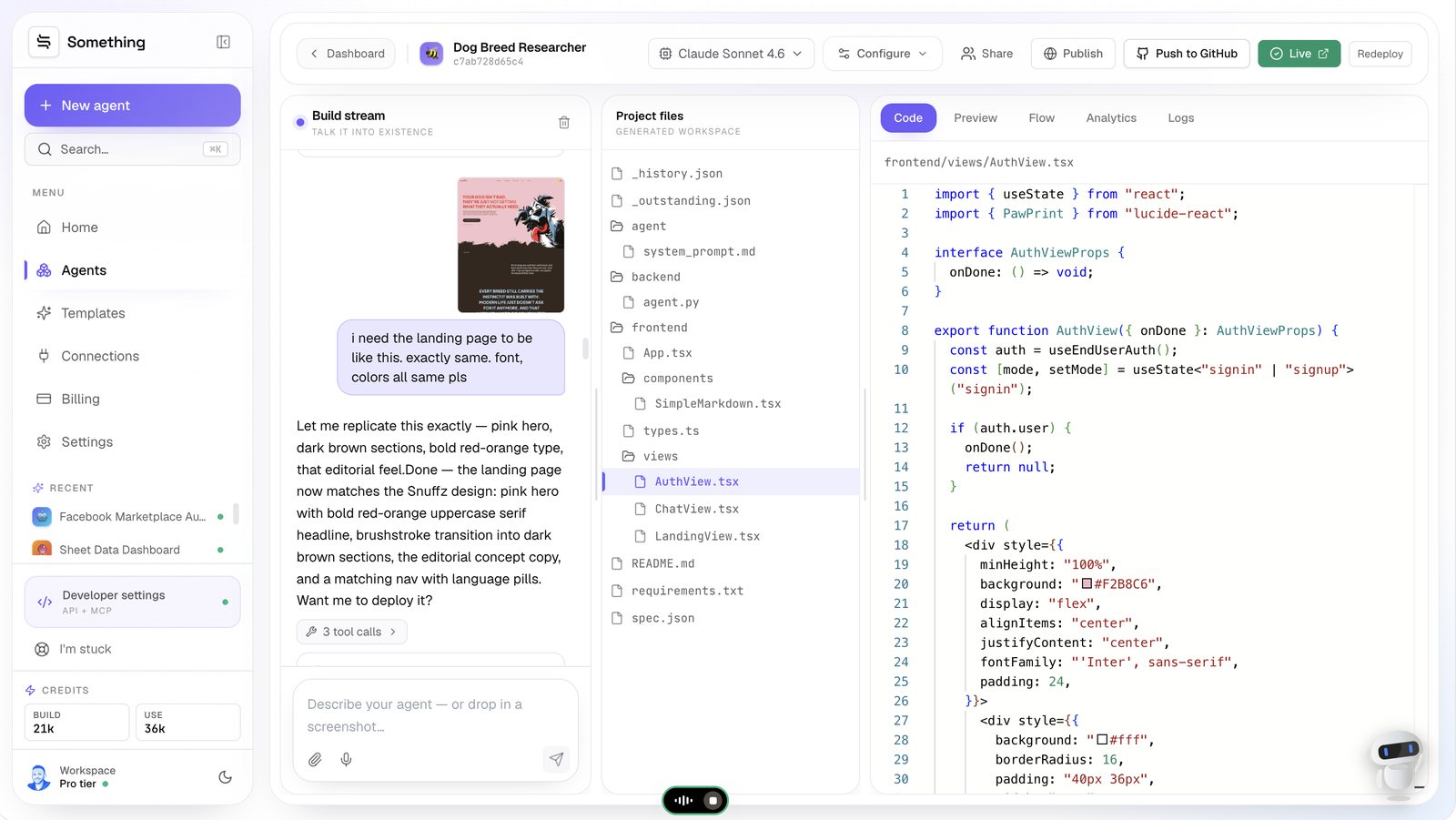
The first pass was close but not right. The illustrated dog had a gap on the right edge, a link that should have been a button was still a link, and the dark brushstroke wave didn't reach the corners. All three are the kind of small visual wrongness that's tedious to describe and tedious to fix.
I described them in one message. What came back wasn't just "done" — it was an itemised list of what changed, marked Build verified:
Build verified
- ✅ Dog pinned flush to the right edge with no gap
- ✅ "Ask your first question" changed to a proper outlined button
- ✅ Dark wave reaches all the way to both corners
Three fixes, one message, a checklist to audit against. That's the loop that makes visual iteration bearable — you're not left guessing whether all three landed.
Step 04 — The result, live
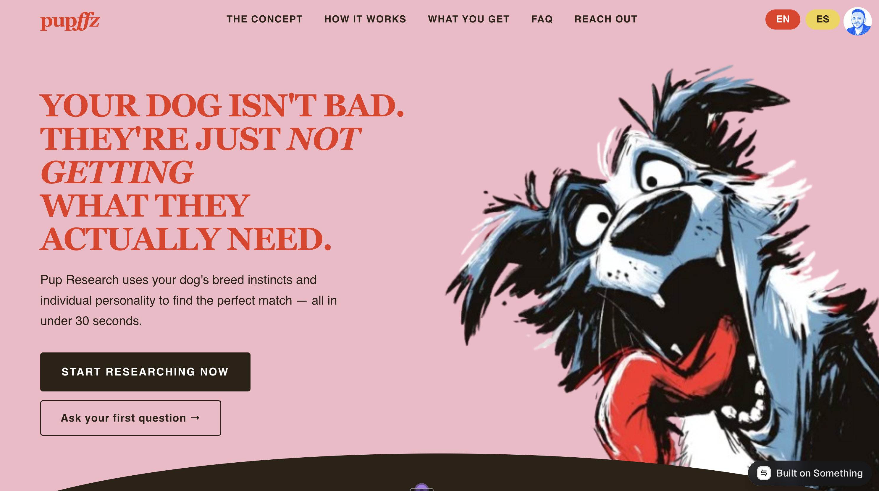
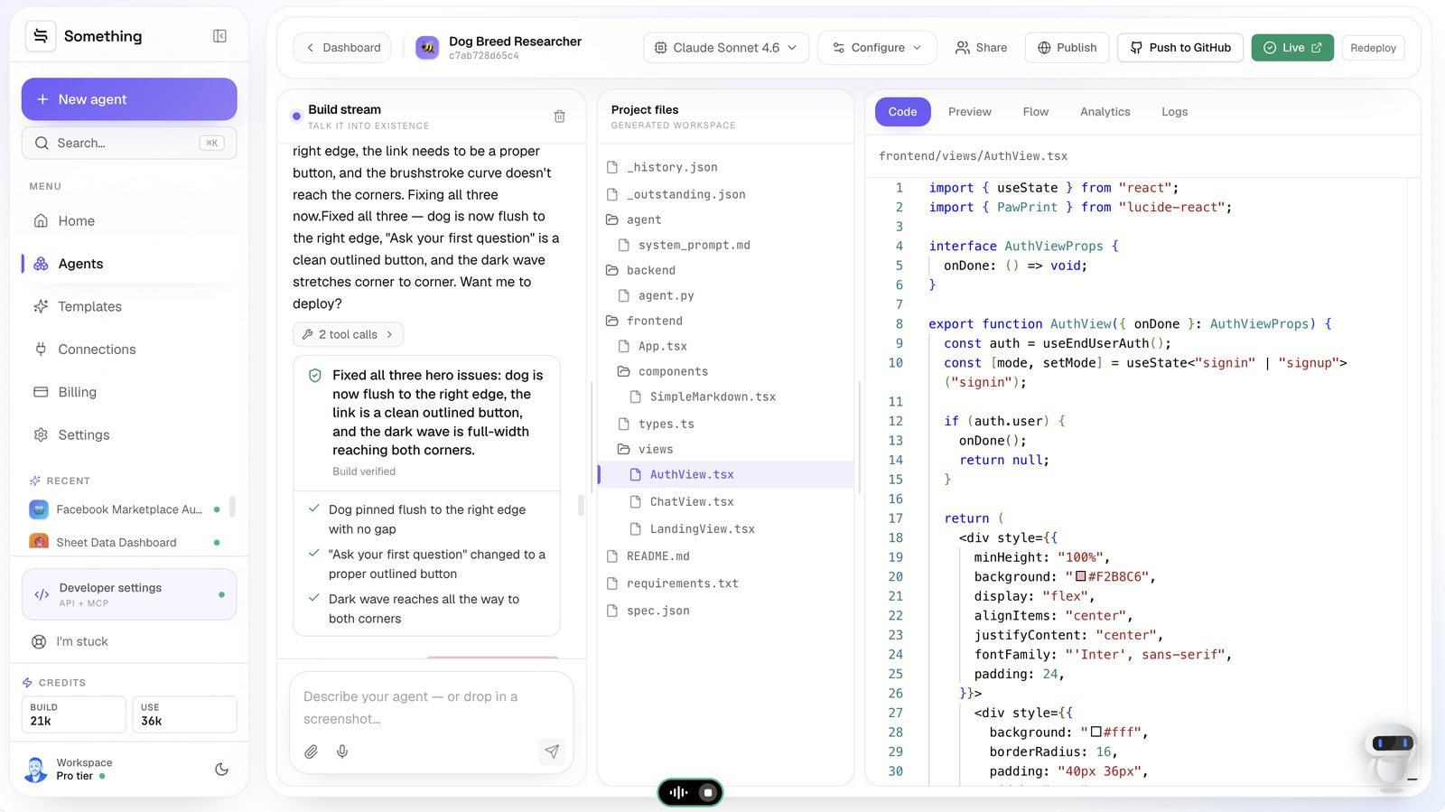
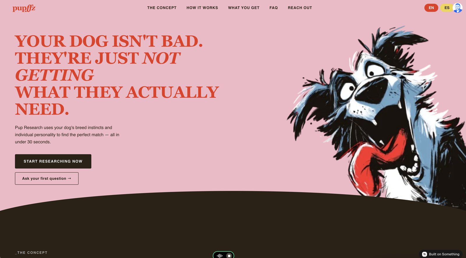
Here's the deployed landing page. Editorial serif headline, the illustrated dog bleeding off the right edge, the brushstroke curve into the dark section, EN/ES pills in the nav, and two calls to action.
Note the language pills specifically. Nobody wired up an i18n library or wrote a translation pipeline — bilingual support came out of the same build.
Step 05 — Auth nobody asked for by name
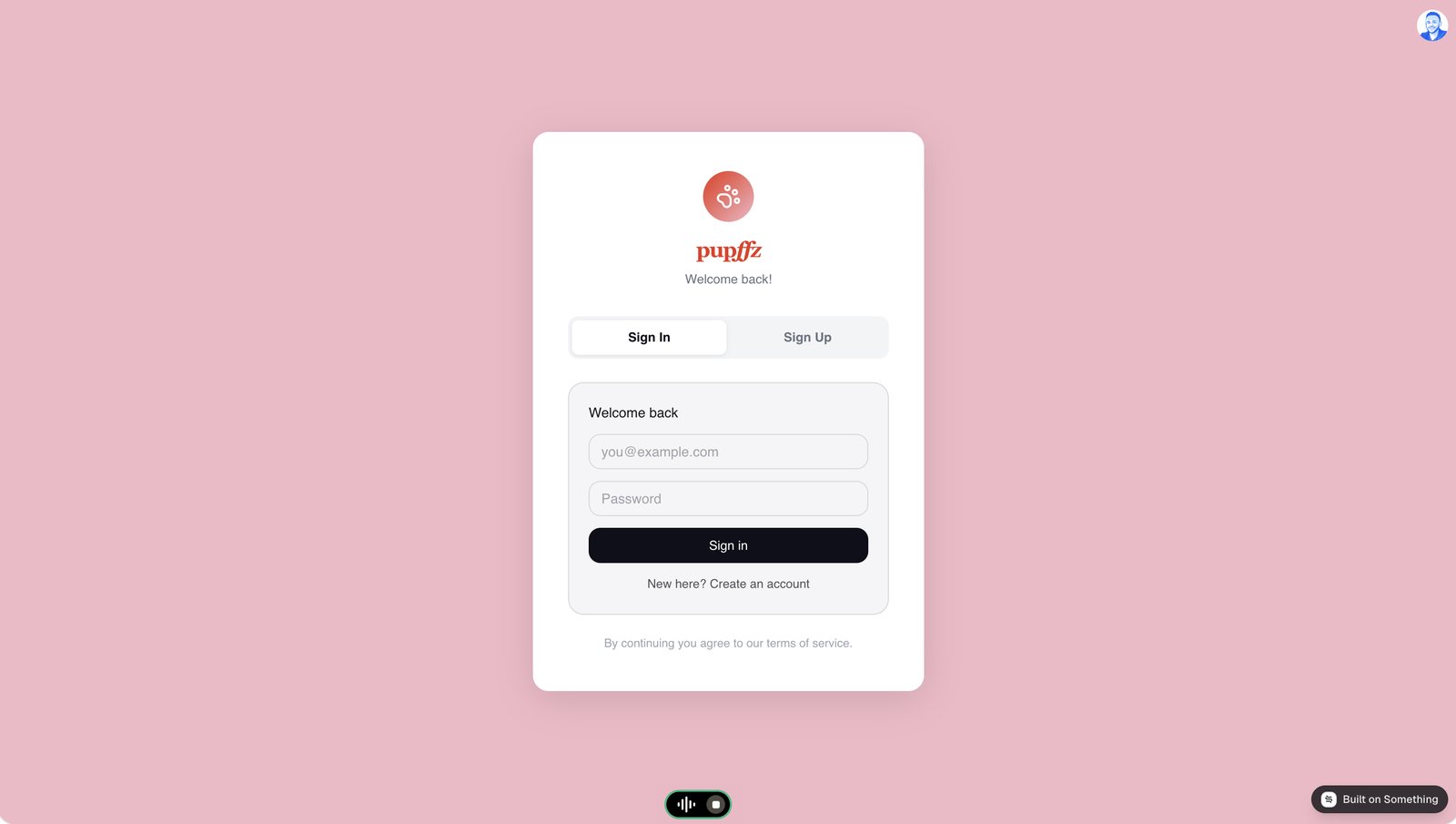
I never said the word "authentication". I tapped Public — anyone can chat and Save conversation history, and this is what those two choices produced: a sign-in / sign-up card, email and password fields, an account-creation path, and a terms line.
In the generated source it's a useEndUserAuth() hook inside AuthView.tsx, with a signin | signup mode toggle. No auth provider to sign up for, no keys to paste, no callback URLs to configure. It's the single most annoying afternoon in most side projects, and it arrived as a side effect of a button press.
Step 06 — The chat, and what "saved history" actually buys
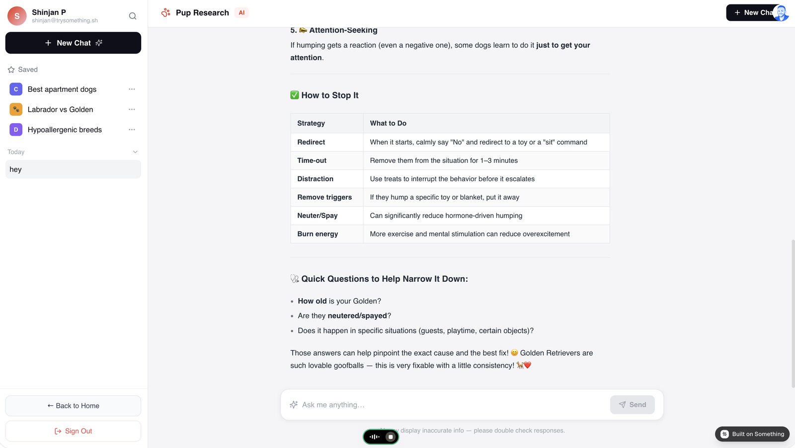
Now the app doing its job. Someone asks about a Golden Retriever humping — an ordinary, slightly awkward dog-owner question — and gets back a structured answer: five likely causes, then a strategy table pairing each fix with what to actually do, then three follow-up questions to narrow it down.
Two things in this screen are worth calling out.
The sidebar is the payoff from Step 01. Saved threads — Best apartment dogs, Labrador vs Golden, Hypoallergenic breeds — persist across sessions and are tied to the signed-in user. That's the data layer that came from a tap.
The answer is formatted, not a wall of text. Tables, headings, bold. There's a SimpleMarkdown.tsx component in the file tree doing that rendering — generated, not installed.
Step 07 — It holds context across the thread
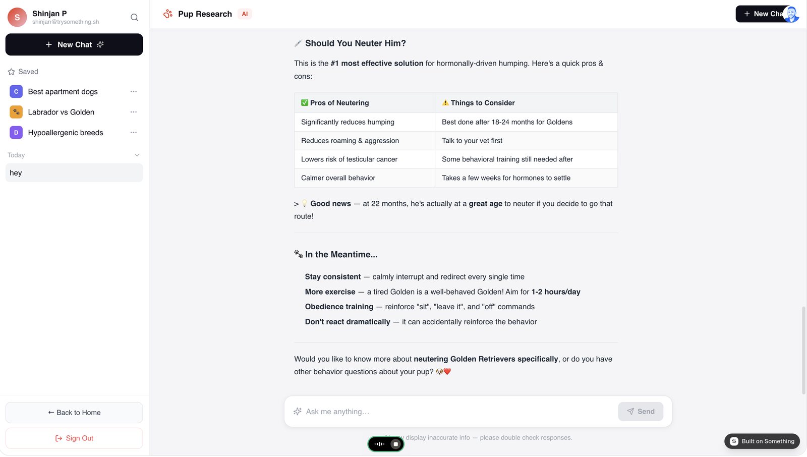
The follow-up is where a chat app either works or doesn't. The user asks about neutering, and the answer comes back scoped to their dog — a pros-and-cons table, then a note that at 22 months he's at a good age for it, because the age came up earlier in the conversation.
It also does the thing a responsible pet app should: "Talk to your vet first" sits in the considerations column, and there's a standing disclaimer under the input that the AI may display inaccurate info. Neither was something I specified. Both are the right default for an app that answers health-adjacent questions.
Worth keeping
If you build anything that touches health, money or legal questions — for pets or people — keep that vet/professional referral and the accuracy disclaimer in the system prompt explicitly. Getting it by default is lucky; getting it by instruction is reliable.
What actually got built
Counting up from a nine-word prompt and a handful of messages:
- A styled landing page matching a visual reference, with a brushstroke section transition
- Sign-in and sign-up with end-user accounts
- Chat threads that save and reload per user
- Markdown rendering with tables
- EN/ES language switching
- A deployed URL, and the whole source pushable to GitHub
None of that is exotic on its own. The point is that the boring half — auth, storage, rendering, i18n — is usually where a promising afternoon dies. Here it came out of two tapped answers and never needed a decision.
The half that still needed me was the taste: noticing the dog had a gap on the right, that a link should have been a button, that the wave stopped short of the corner. That's the right division of labour.
Have a screenshot of something you like?
Drop it into the builder with one sentence about what it should do. That's the whole starting move.